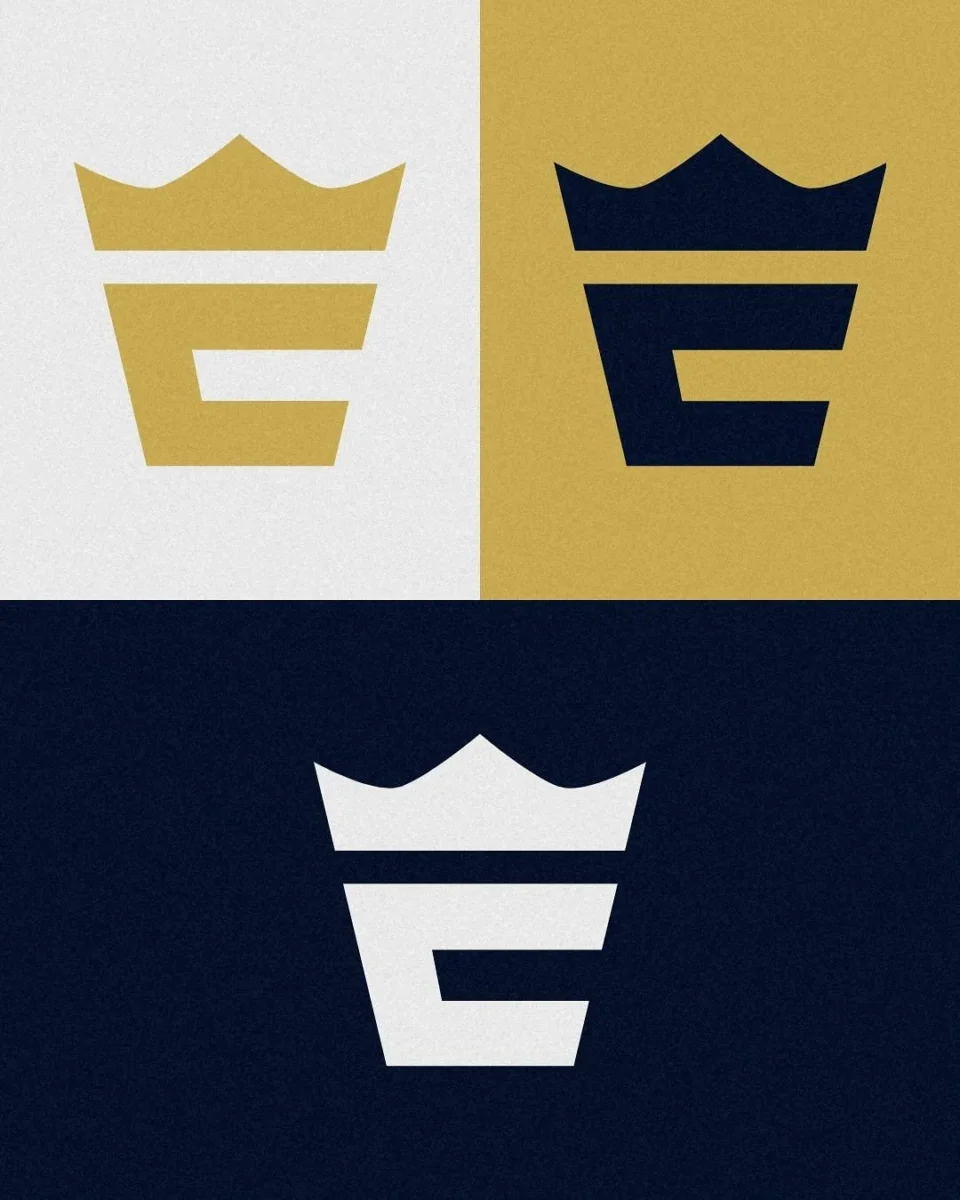
Einmal "Coffee to go", bitte!
In general i don’t think the new Logo is not bad. It’s modern and with the different color variations (maybe too many) you can use it in several enviroments. Unluckily it reminds me on a coffee to go cup. It’s not a graphical sin. I just think the old one was better. I really liked the old Logo. I would have just used another color instead of the “gold” which would have made the usage much easier. Else i didn’t have anything to complain about the old logo. At the end of the day this means that we have to go to hungary once more next season to visit a homegame of the Enthroners. Else the photos of this season will be “outdated”. That’s the same with Berlin Thunder …But i’ll talk about that somwhere else.


